Button
Preview
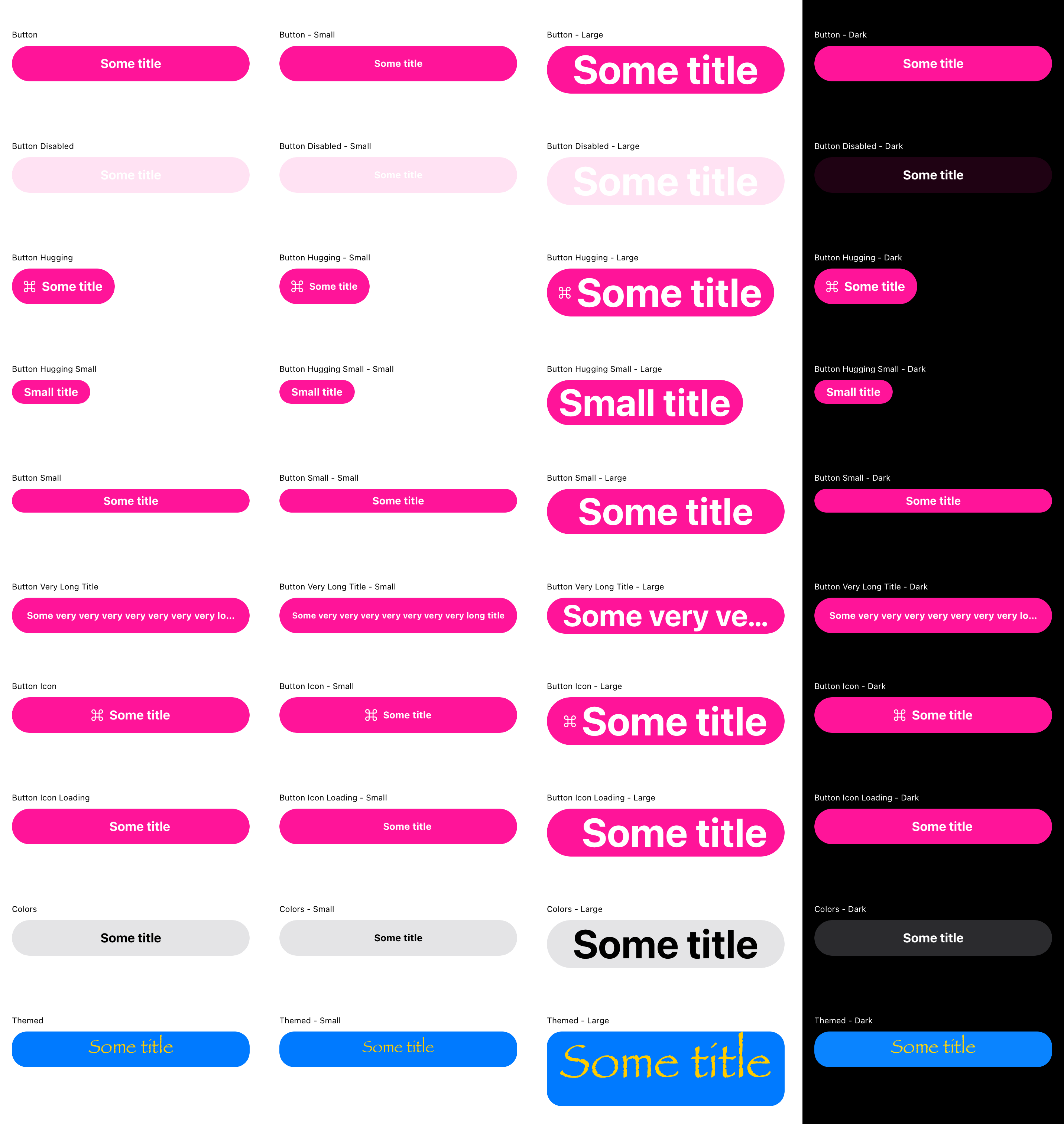
Specifications
Types: Primary, Secondary.
Sizes: Small, Normal, Large.
States: Normal, Active, Disabled
Behaviour: onTap changes state to “Active”. If interaction takes longer than 300ms changes state to “inProgress” [TBD].
Recommendations
As a rule of thumb, there should be only one primary button per screen. If you need more actions, please consider secondary, and/or tertiary buttons.
Keep text concise. Text longer than 22 symbols, might be truncated on smaller screens.
API
class ButtonConstants(theme: CurrentTheme) {

    val defaultBackgroundColor = theme.colorPalette.primary
    val defaultContentColor = theme.colorPalette.onPrimary
    val disabledBackgroundColor = theme.colorPalette.primary.alpha(0.30f)
    val disabledContentColor = theme.colorPalette.onPrimary

    val textStyle = theme.typographyScale.textL.copy(fontWeight = Bold)
    val textStyleSmall = theme.typographyScale.textM.copy(fontWeight = Bold)

    val height = 48.dp
    val heightSmall = 32.dp

    val iconSize = 24.dp
    val iconSizeSmall = 16.dp

    val spaceBetween = SpacingScale.xs
    val paddingHorizontal = SpacingScale.md
    val paddingVertical = 12.dp
    val paddingVerticalSmall = 6.dp

    val cornerRadius = theme.cornerRadiusScale.buttonRadius
}
Preview from automated tests