Badge
Badge is a block that accomodates small pieces of information
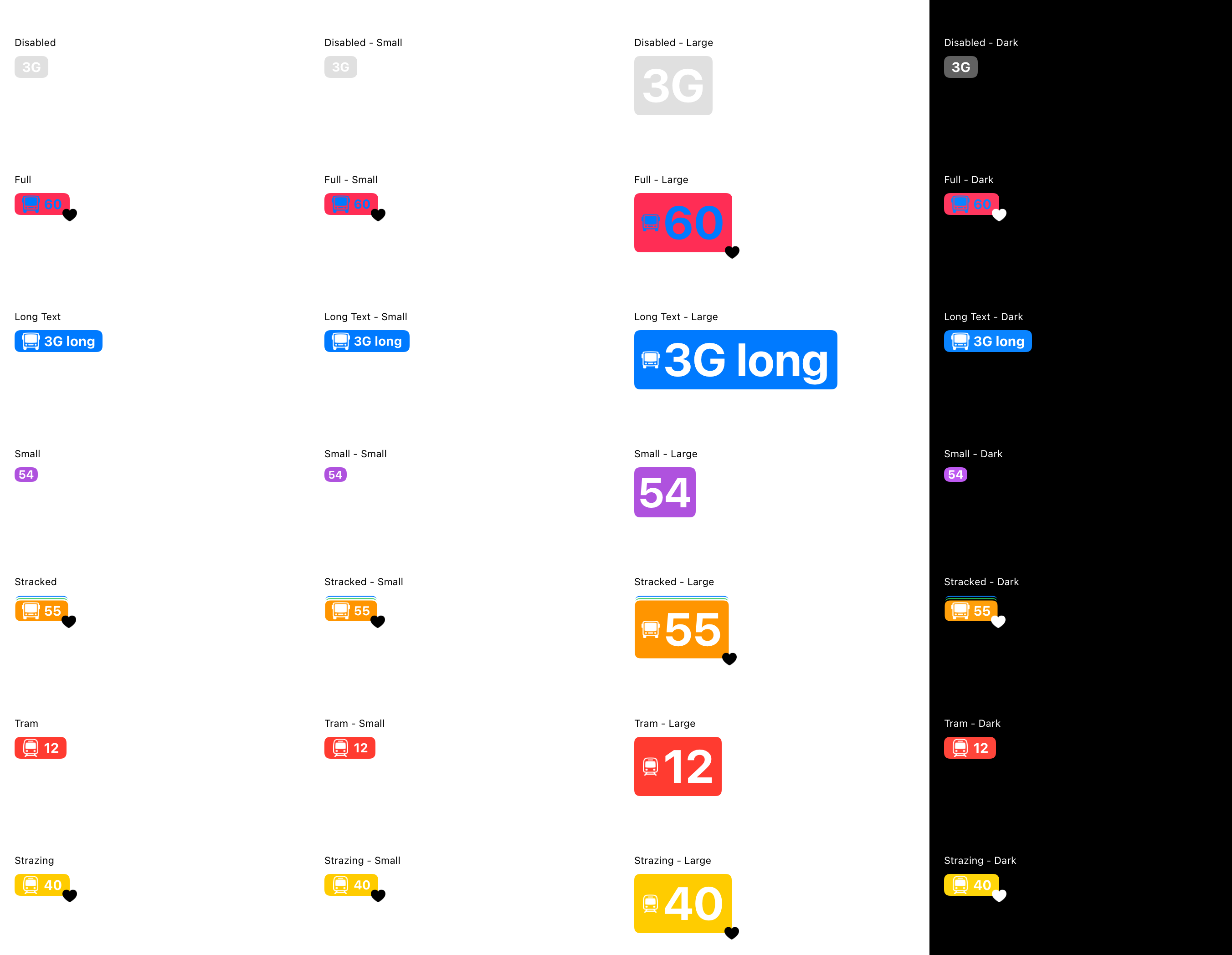
Preview
Usage
represent vehicle type in route search (e.g. Audi A3)
represent PT vehicle route (e.g. S5)
represent payment status (e.g. “DEFAULT”)
represent car type in stationary car sharing (e.g. budget)
represent POI in stationary bike sharing (e.g. “2 Riese & Müller 60”)
highlight new/upcoming provider in the app (e.g. “NEW” or “SOON”)
Variations and constituents
badge types sizes: medium, small
medium badge
may have an icon
may have a subbadge icon
may be stacked (in stacks of 2 or 3 badges) vertically extension: in PT flow content inside fits a maximum of 4 string characters and truncates afterwards
small badge
doesn’t have an icon
may have a subbadge icon
cannot be stacked
texts inside are always uppercase
may be disabled
API
class BadgeConstants(theme: CurrentTheme) {
    val defaultContentColor = theme.colorPalette.onPrimary
    val disabledColor = theme.colorPalette.grayScale.gray300
    val borderColor = theme.colorPalette.background

    val textStyleMedium = theme.typographyScale.textM.copy(fontWeight = Bold)
    val textStyleSmall = theme.typographyScale.textS.copy(fontWeight = Bold)

    val minHeightMedium = 24.dp
    val minHeightSmall = 16.dp

    val cornerRadiusMedium = CornerRadiusScale.xs
    val cornerRadiusSmall = CornerRadiusScale.xxs

    val iconHeight = 20.dp
    val iconWidth = 20.dp

    val subBadgeIconHeight = 16.dp
    val subBadgeIconWidth = 16.dp

    val spacer = SpacingScale.xxs

    val horizontalPaddingMedium = SpacingScale.xs
    val horizontalPaddingSmall = SpacingScale.xxs

    val verticalPaddingMedium = SpacingScale.xxxs
    val verticalPaddingSmall = 0.dp

    val maxStackedBadgesNumber = 2

    val borderWidth = 1.5.dp
}
Preview from automated tests